On-Country Pathways Logo tells of our Creation and the Future
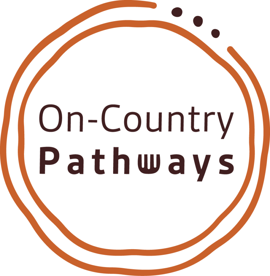
We think our new On-Country Pathways logo beautifully tells the story of our creation and the future.
Two organic circles surrounding the text encapsulate the journey or pathways Indigenous young people will take as they prepare to enter the workforce.
The three dots represent a connection, a joining of the pathways, stepping stones to new possibilities. They also symbolize the three people who had the original idea of helping Indigenous young people into the commercial construction industry, including our general manager, Proud Wiradjuri man, Jebb Hutchison, Jonathon Whelan and Gareth VanNoort.
The ‘W’ in pathways has been replaced with the Indigenous symbol for a goanna print Jebb’s totem animal, and an important connection to his Country, up around the western Riverina region in New South Wales.
The earthy colour tones we chose for the logo emphasise the deep connection to our land, our traditions, and our culture.
The logo was developed for On-Country Pathways by Indigenous strategic, creative, and marketing company Little Rocket. Based in the inner Melbourne suburb of Fitzroy, Little Rocket is celebrating 10 years of deadly design and creative projects this year.
You can see more of Little Rocket’s work at: https://littlerocket.com.au/


